

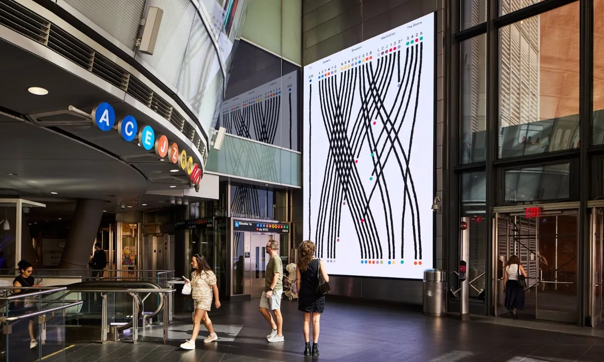
NY Subway data turned into an animated story
“Whether you think you can or can’t, you’re right.”
— HENRY FORD
This time we’re colliding space logos, dead eyes, comfort films, job impact and going from built to launch in record time. Please skip around, read what you want to. Find something interesting in your own internet travels? Send me a link
—JH
This Thursday

I’m excited for Joe Ciuffo’s live session on Thursday! Joe was a panelist a last year’s PathCamp. He’s a sharp, friendly guy with a good sense for what actually works. Here’s Christian on what to expect from Joe’s session this Thursday:
Joe Ciuffo is a Professor of Marketing at Hanover College and a former Product Marketing Director at Genesys, where he worked on AI in customer experience. In this session he’ll show how to build an AI workflow for course planning and design.
Joe will walk us through a practical chain of tools for research, outlining, lesson drafting, media creation, practice activities, and feedback management, with clear prompts and handoffs between tools and with your teaching voice leading the process.
You’ll learn how to...
- 🗺️ Map a repeatable workflow
- 👌 Choose the right tool for each step
- 🤔 Set guardrails for accuracy and quality
- 🎉 Adapt the system to your subject and learners
You can expect...
- 🙌 Time-saving tactics for drafting course outlines, lessons, formative assessments, and rubrics
- ↪️ Review techniques to keep everything accurate, accessible, and aligned with outcomes
10 curious links that would have killed the cat
🔒 Vault is an open source, private, local organizer for notes, links and images. I love that you own your own files. Easy enough to put them in Dropbox or iCloud for cloud storage if you want to.
🚇 A data love letter to the Subway. “The animated installation visualizes each train line as a character whose unique qualities are extracted from MTA data. [Designer Giorgia Lupi and her team] wrote a story, transforming their findings from the data repository into a narrative and script.”
💼 Choose Impact helps you compare the merits of a job to your expectations. Good for a gut check if you’re reevaluating where you’re at now or comparing a couple new options.
🚀 Space Exploration Logo Archive. Past to present, real to Star Wars, it’s all here. Check out the funky letters on this one.
⏳ The compound interest of design—what not to build. “Every guess you make upfront is a liability. Every deliberate act of restraint is an investment. The things that matter take time, which is exactly why nobody wants to invest in them.”

VFX artist Todd Vaziri breaks down hidden effects in Star Wars
🎬 ILM Visual Effects artist breaks down hidden VFX. Gosh, I’d thought, that’s a set or that’s green screen stuff. Turns out it’s usually both. This is one of those videos I meant to only watch a couple minutes of but finished all of.
🍿 Speaking of movies: In praise of “comfort films”. The zeitgeist is chaotic. Stressful. So maybe you don’t want all your media to be stressful too. This is about that. For me: The Big Lebowski, Star Wars, The Royal Tennenbaums.
👀 Dead Eyes is a podcast documenting one actor’s quest to discover why Tom Hanks fired him from a small role in the 2001 HBO miniseries Band of Brothers. The series spans ‘20-’22, an interesting time in the world and in the life of comedian Connor Ratliff. I just found this last week and am currently on ep 10. Heartwarming, insightful about setbacks, consoling for folks who work in creative mediums.
📚 65 essential children’s books. My first two jobs were as a librarian. I’ve been reading to my kids before bed for a decade. A lot of these are shelved in my heart—Goodnight Moon, If You Give a Mouse a Cookie, Good Night Gorilla, *happy book sounds*
🖊️ Nikita Busyak sketches landscapes with lines in sketchbooks. I need to pick up my Microns again.
in Greenville, SC
As I mentioned above, we’ve got an outstanding session coming up for you on Thursday. Joe Ciuffo’s back to get practical on reducing your launch timeline, no matter what you’re launching. Looking forward to it! See you there.

Last week I tore apart my workspace.
As you may know, Pathwright’s been 100% remote for the last five years. Which means my work setup can be whatever I want (within the limits of what my family will tolerate).
As I write this to you, I sit at a nook I carved out for creative focus.
Above me stretches three rows of books—graphic novels, typography reference volumes, a slim Seth Godin I’ve been meaning to read for months but just, you know, haven’t. To my left: A worktable I built a couple years ago. To my right: A window facing my street. Over my shoulders: A napping dog and cat.
Here, I’ll show you:

Anyway, it’s really working for me. I have every reference I need within arm’s reach, but none within my field of view. It’s a little tidy, a little messy. Just the right amount. The last piece of the puzzle was a 2' x 3' butcher block slab I installed as my desktop.
I’m sure I’ll mix things up again in a couple years. I don’t mind because design is never design—it’s always redesign. Fun to take another pass.
Hey, I can feel it: Your next pass is going to be your best yet. Keep at it, pal.
To the next pass.
High five,
Justin Hall
Editor, Partner at Pathwright