

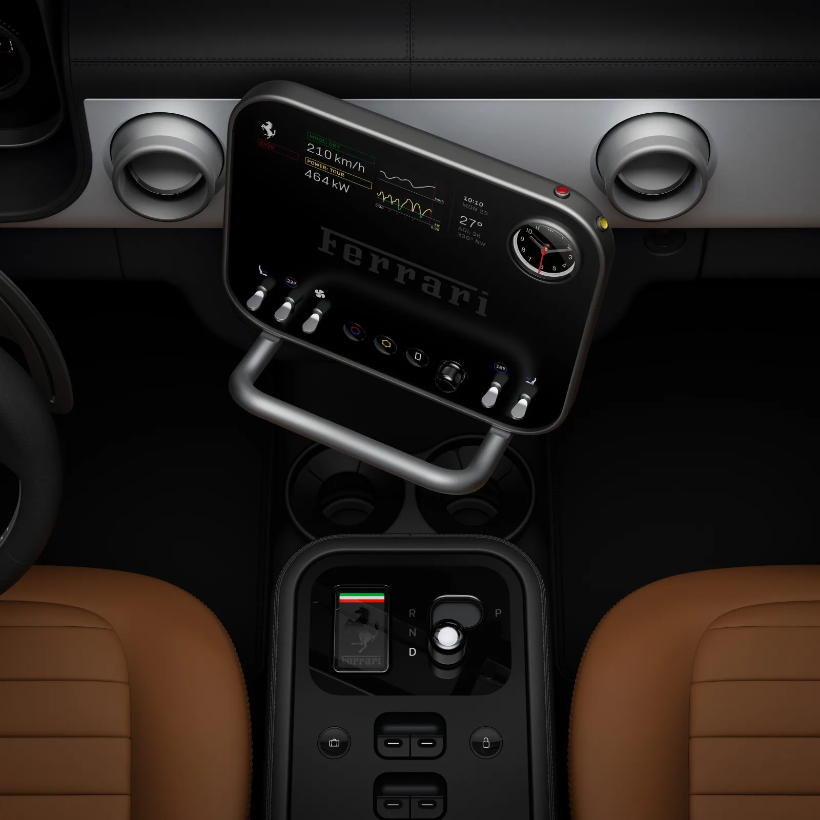
Ferrari’s all-electric Luce elegantly combines physical and digital controls
It’s spring! Check your lease, you’re living in Pollen City. This time we’re colliding Ferraris, manholes, movies, bestsellers and turning a sketch into a custom sticker. More on that last one next.
Please skip around, read what you want to. Find something interesting in your own internet travels? Send me a link
—JH
Side Project
This year Pathwright is a returning sponsor of Greenville’s local tech conference, Grok Conf. Part of my work in helping make Grok happen involved doing something I hadn’t done in a while—building letters from scratch.
Here’s a behind-the-scenes peek into my process.

My initial sketches
I start with a sketch. I wrote this sign-off for the footer of Grok emails — “Y’all Be Good Online”. The pen-and-paper stage helps me find what about the letters I like enough to try building digitally. I don’t achieve perfection here, I’m just out to pique my own interest.

Guides and first-draft vectors
Next I move into Adobe Illustrator. Here I’m building vector versions of the letters with guides and width markers (the circles you see below) to get things consistent.
The first version always lacks the sketch’s zing. That’s okay—I work from technically consistent (always a little boring) to artistically consistent.

Circles help me get letter widths consistent
Next I start breaking rules. I’m not sure if you know this, but even highly rational fonts like Helvetica have characters that aren’t consistent. Widths of letter vary slightly to make them optically correct. Heights too. Not tripping up the eye
rather than being ruler-perfect gets a font the gold metal. So I begin adjusting widths to get things looking right.
After that, it’s about flow. How does one letter lead into the next? One line into the next? How does the whole phrase look from a squinting distance? I go back to paper to re-sketch letters that aren’t working. Eventually everything fits together nicely.

Finished lettering
After I finished the letters, I used them to mask in colors.
When I can, I prefer to use images with gradients in them sourced from Unsplash rather than creating a gradient in Photoshop or Illustrator. The image always looks less artificial. Thanks to Sean Sinclair for this one!

Adding a gradient—my plan all along
Last, I order stickers. These just came in a couple days ago.
We’ll give them away for free at the Grok Conf check-in table.

Finished stickers hot off the press
I’ll level with you—I didn’t enjoy all of this process.
But boy did I find it satisfying.
I got to prove to myself I can still do this kind of thing. And I got to contribute a little creation for a crowd of tech pals whose creations I also use and enjoy.
Not bad, not bad at all.
10 curious links that would have killed the cat
⏳ The joy of building slow. “Slow success means you get to stick with an idea long enough for it to get interesting. Interesting work takes time. Many artists spend their entire life exploring a single technique or topic. Deeper work leads you to deeper meaning leads you to deeper fulfillment.”
Not Boring ∙ Blog Post
🏎️ Ferrari’s first all-electric car, the Luce, features very clever dashboard design. The center display’s combination of tactile and digital controls is especially smart.
Ferrari ∙ News
🗺️ An interactive map of walking routes between towns, cities and landscapes. Leave the car, take the path. Regrettably (for me), it’s a Britain only thing.
Slow Ways ∙ Web App
✈️ Kevin Kelly, author and founder of Wired, dishes out 50 years of travel tips. Here’s one: “Sketchy travel plans and travel to sketchy places are ok. Take a chance. If things fall apart, your vacation has just turned into an adventure. Perfection is for watches. Trips should be imperfect. There are no stories if nothing goes amiss.” [Checks headlines] Grain of salt on that one actually.
The Technium ∙ Blog Post
🌞 Scientists just figured out why the sun’s been “glitching”. “The entire Sun oscillates in a globally coherent way, and the oscillations are formed by sound waves trapped inside the Sun that make it resonate just like a musical instrument.” Okay whoa.
404 Media ∙ Video

“The Manhole” is an adventure without a finish/goal
🕳️ “The Manhole”, a 1988 HyperCard game by the guys who made Myst, is available on Internet Archive. “The Manhole is a notable computer game because … it has no goal and no end; the object is simply to explore and have fun.” My daughter and I really enjoyed clicking through this.
Internet Archive ∙ Video Game
🗿 The Metropolitan Museum of Art added 138 3D versions of important works of art. Look for the little “View in 3D” label underneath the images—and click it.
The Met ∙ Interactive
🌵 In the sands at the Dakar Rally. Every January trucks, motorcycles and dune buggies blast across thousands of miles of unforgiving desert in the toughest race on earth. This is what it looks like.
Hodinkee ∙ Article
🍿 Why don’t movies feel “real” anymore? Look, even documentaries are somewhat staged. None of it’s real real. But the goosebumps you get watching a movie sometimes come from “perceptual realism”—when your brain can process what it’s seeing with the same mechanisms it processes daily life. Movies that did this for me lately: Jurassic Park (1993), La Femme Nikita (1990), Isle of Dogs (2018).
Like Stories of Old (YouTube) ∙ Video Essay
🏆 The annual Tournament of Books is in quarterfinals, approaching the championship round. I love following this every year and adding to my own reading list. My coworker Mark’s favorite, Katabasis, was in yesterday’s round.
Tournament of Books ∙ Website
in Greenville, SC
Here are four updates to Pathwright from Paul:
We quietly shipped a handful of small improvements last week — especially for those of you with learners registered across multiple Cohorts.
✅ Improved Cohort Access: Previously, when a learner's Cohort access expired, they'd hit a full-screen message blocking the entire interface. Now they can access the About page or switch to another Cohort if they're in one.
✅ Discussion Panel: Fixed a rare but irritating bug where learners in more than one Cohort could incorrectly see a locked overlay on a Discussion that should have been accessible.
⬆️ You can now link to Block results from the Path Navigator when you're already in the same Step.
⬆️ Replacing a background image on a Path or Banner now resets blur and overlay settings to defaults — a fresh start for the new image.
The daily highs are higher here at HQ in Greenville, SC. Storms moved through recently, sweeping rain across yards, sidewalks and cars. The curbs ran yellow with pollen. Better on the ground than in the air I’m breathing, I always think.
Hope you’re enjoying a little change in your corner of the world too. I’m going for a walk in a minute. Hope you get to too!
High five,
Justin Hall
Editor, Partner at Pathwright